
(image credit: San Francisco Chronicle)
Graphical visualizations are often the best way to understand data. The San Francisco Chronicle recently published this dynamic set of visualizations looking at the Asian American population. It allows interactive exploration of California Asian American population trends. Some of the graphs hint at interesting changes that have happened in the California popultion.
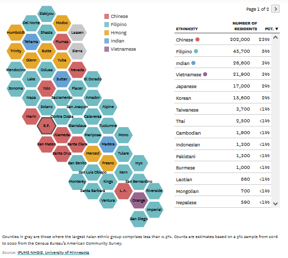
The graph excerpt on the right shows the largest Asian American group within a particular county. One of the more interesting findings is the large number of yellow counties in the far north of California. This reflects the movement of Hmong who became part of the “Green Rush” after the legalization of marijuana in the state. That movement has become significant enough that many Hmong there are experiencing a discriminatory backlash.
I also found it interesting that Filipino Americans are widely distributed, making up the highest Asian ethnicity in the majority of California counties. My guess is that the medical facilities in many of the smaller population counties employ a lot of Filipino nurses. Of the most populous metropolitan areas in California, Filipinos are the largest in San Diego problably because of the navy bases there.
There are many other graphs and tools available at this site. If you are interested in Asian American demographics, and California Asian American in particular, I suggest you check out the SF Chronicle’s excellent resource.


